Field: B2B Healthcare
Project duration: 3 months
Role: UX UI Designer
Background
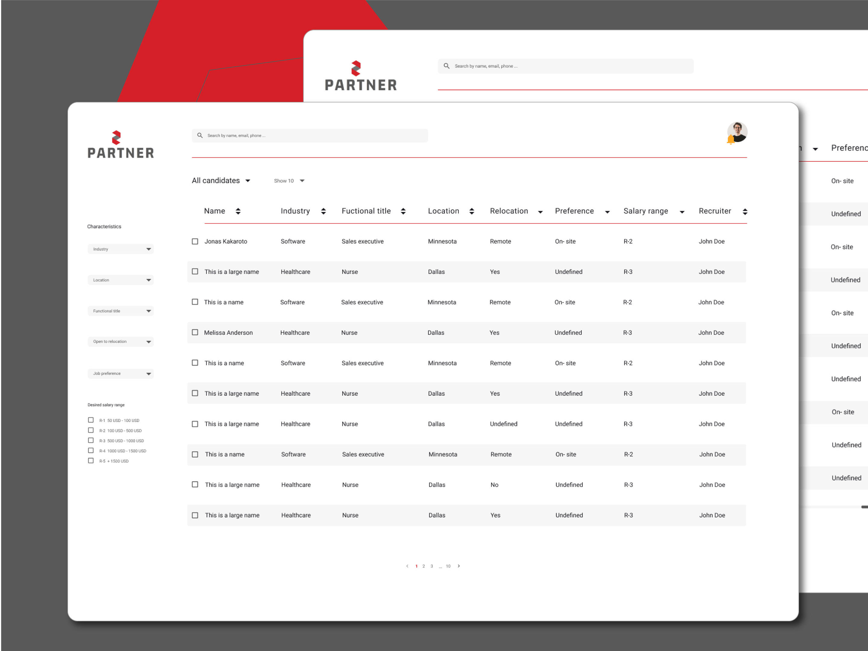
Doctor Form is a feature of a whole healthcare system, which is used in hospitals and clinics in USA to collect information about providers and keep data up to date, so that patients can find specialists according to their needs in an easier way. This process is often arduous and complicated for providers and the management data staff. This project aimed to improve and simplify the process of creating and editing a form to ask the provider to update their information.
Design process
01 User Research
During the first weeks of the project, five user interviews were conducted, two were stalkeholders and three were providers. All participants had prior knowledge of the function and had been using the platform regularly for more than one year.
The interviews were recorded with the permission of the participants to extract the main insights. During the interview the three providers were asked to show us how and what they use the platform for. While showing us what they were doing, they were asked to tell us what they don't really like and why and how they felt working with Provider Form.
After the interview we worked with Atlasti software to create categories and identify the most significant insights and learnings.
User Pain Points
• Providers do not have much time to update the information they are asked to provide.
• To navigate in the form you have to scroll to find other sections.
• There is information that requires hospital staff approval for editing.
• The preview is available until before submitting the form.


02 UX working session & Ideation
After identifying the needs and the main pain points, numerous working sessions were held through miro board, teams and figma to create the first sketches.
We worked with the "How might we..." method to generate key questions and then brainstorming to generate solutions.
• How might we simplify navigation through the form sections?
• How might we avoid the feeling of "overwhelming" when filling out the form?
• How might we let the provider know which information needs to be updated in an easier way?
03 Workflow Doctor Form
The user can create a doctor form from scratch or choose to edit the one they prefer.

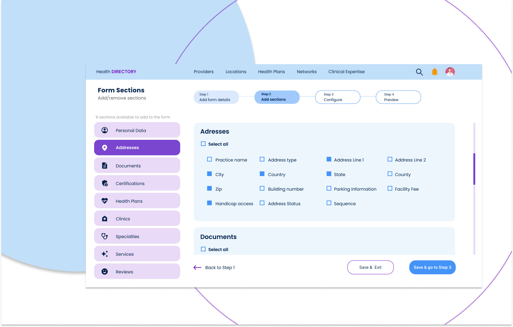
04 Wireframes
The new design proposal solved the following user pain points:
• User friendly navigation, the process has been divided into steps so as not to overwhelm users
• The user can navigate within the form using the buttons or the stepper
• The sections are now grouped in a side menu so that the user can add information easily
• In the configurations section only the sections in which the user selected something will show


05 Prototype & Testing
A static version of the prototype was created in Figma and a more interactive version in Axure to ask different users to perform some tasks with Doctor Form. In interviews lasting approximately one hour, five participants were asked to perform tasks such as adding information from a specific section, navigating through the form, and checking that all data were correct.
Learnings:
Some participants find it easier to create/edit the form if they know where they are in the process. It was not very clear that you can navigate through the stepper.
• I do really like to know what are the steps of the process and what sections follow, but can I click here? I'm not sure, is that a button? (About the stepper).
We simplify the process for users to change or modify settings only where needed
• It is much easier to edit the information in the sections I need! It totally makes sense! Why didn't you do it before? I really like this!
To avoid long scrolling, we created a side menu, so that users can navigate more easily through the sections
• It's definitely a brilliant way to sort the sections! I hated having to scroll to find the sections I needed
06 Visual Design
The client has a design system already established. We worked under the standards of this DS and proposed some necessary adaptations of the components. In terms of accessibility, AA and AAA standards were met.


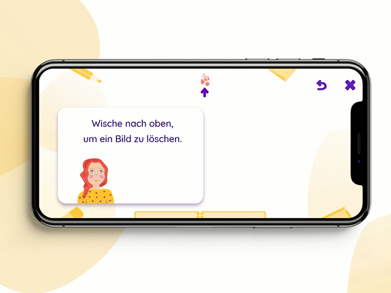
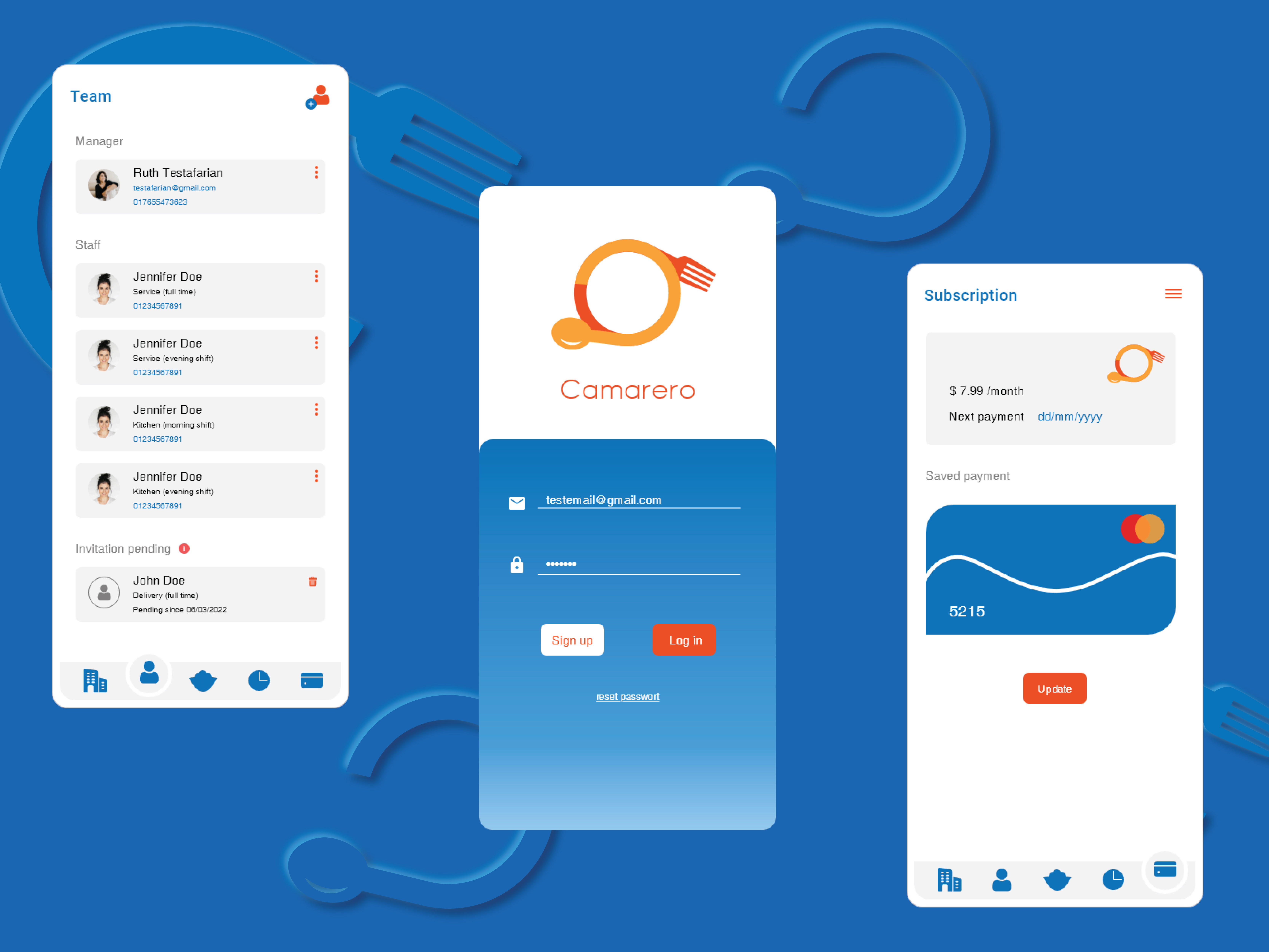
Design proposal for mobile view
In the mobile version, providers will be able to update their data easily. Sections will be available for them to navigate through and those that need to be updated will be indicated with a hint to complete the task. This way the provider will know what information needs to be updated.
07 Deliverables for Dev Team
In addition to several meetings with the development team to present the prototype and the visual design, several documents were delivered with detailed information about the components and elements necessary for the development of the interface. Such details included behaviors of the elements of the functions, with their respective link to the DS and the figma/axure files.