Background
Recruitment work is sometimes an arduous task that involves stressful situations. Partner's goal is to make that process easier and more user friendly. As well as to generate positive work experiences. With this platform users can easily find the best candidates for a position and have more time for other tasks.
Steps of the Design process
01 UX Research
To extract qualitative data, online exploratory interviews were conducted with 10 users. These interviews were recorded with their permission.
To extract quantitative data, users were asked to perform a task with the current platform and then the INTUI question- naire was applied to know how intuitive the platform was perceived.
We also conducted a workshop with 7 users and 2 designers and 1 developer in which we worked with the Jobs to be done method, to explore more about the context, the tasks an the recuiters journey to extract the main pain points and to learn more about their needs and user feelings.
02 UX Workshop & Ideation
In this phase a Persona was created with the information obtained from the previous phase to generate solutions to the user needs through the HMW method. This stage was also focused on how to create positive experiences through the use of the platform.
03 Heuristic evaluation & Risk analysis
Having a list of the solutions proposed by the team, a table of the risks was created, to monitor and prevent platform issues.
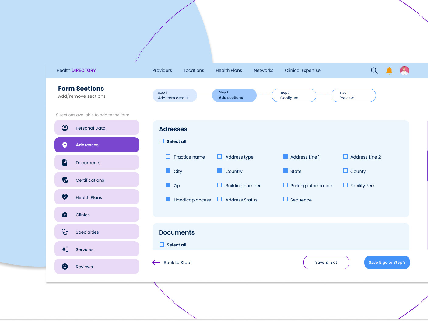
04 User flow & platform architecture
With the information gained from previous phases, a diagram of the user workflow was created, as well as the information architecture with the development team in India.
05 Wireframing & Prototype
High-fidelity wireframes of the key functions of the platform were created, as well as a clickable prototype in figma.
06 Prototype Testing & Feedback
The testing phase was carried out with 5 users. While working with the platform we asked them to think aloud to write a protocol about what they see, feel and think about the platform prototype.
07 Visual Design & Design system
With the information obtained in the testing phase, some changes were made to the platform. Subsequently, the design of the interface was carried out. The visual design was carried out under the human centered design guidelines and the client guidelines.
08 Platform development
The team in India was in charge of the programming of the platform under the guidelines of the design team in Germany.
Interview Insights

Questionnarie INTUI results (Ulrich & Diefenbach, 2014)
The INTUI-model suggests four components of intuitive interaction, namely, Gut Feeling (G), Verbalizability (V), Effortlessness (E) and Magical Experience (X).
Gut Feeling (G) 3.9/ 7 Verbalizability (V) 4.4/ 7
Effortlessness (E) 3.8/ 7 Magical Experience (X) 4.4/ 7
The test results showed that the platform is perceived as only moderately intuitive and with some shortcomings, especially with regard to the Gut Feeling and Effortlessness components.
Jobs to be done
Some examples of the UX research and some user pain points.

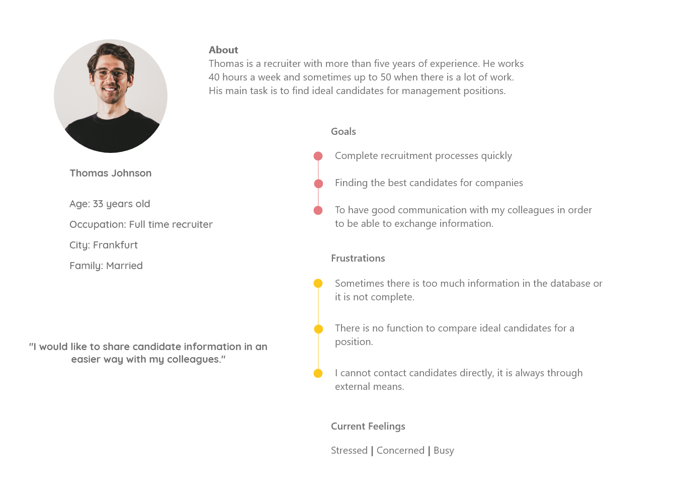
Persona
Creating personas help me to understand more about the user profile, about their goals, their frustrations and their feelings.
How might we help recruiters to find the ideal candidate
for a position in the easiest possible way?
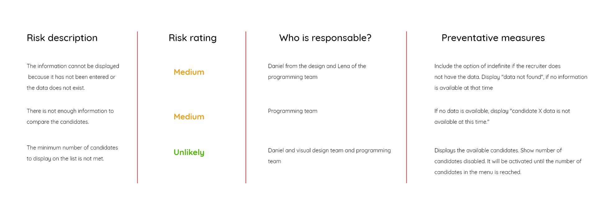
Risk analysis
Risk analysis helps us to anticipate errors and to act quickly if they occur. This table shows some examples of the risk analysis of this project.
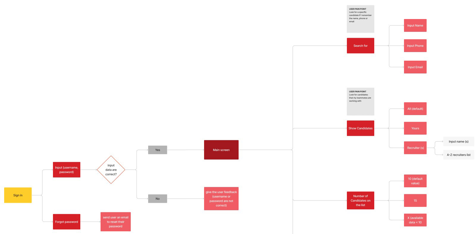
User flow
Visualize the user flow is important to create the structure of the platform and also to know when errors may occur and to know when the user has to make important decisions and to identify situations where the user has to receive feedback.
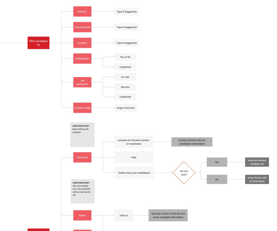
Wireframing
Wireframes of the main interactions of the platform were created, in order to proceed to the prototyping and testing phase.
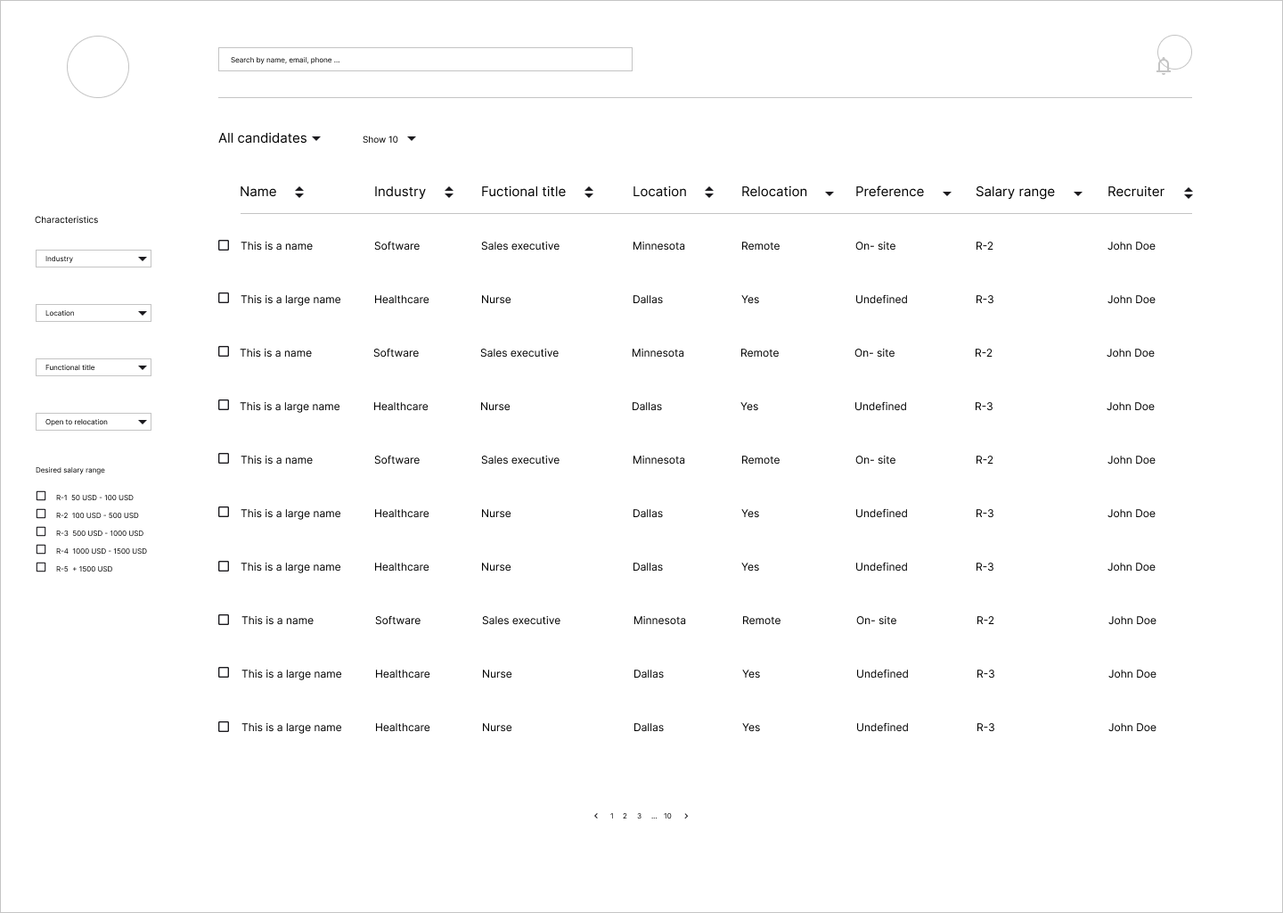
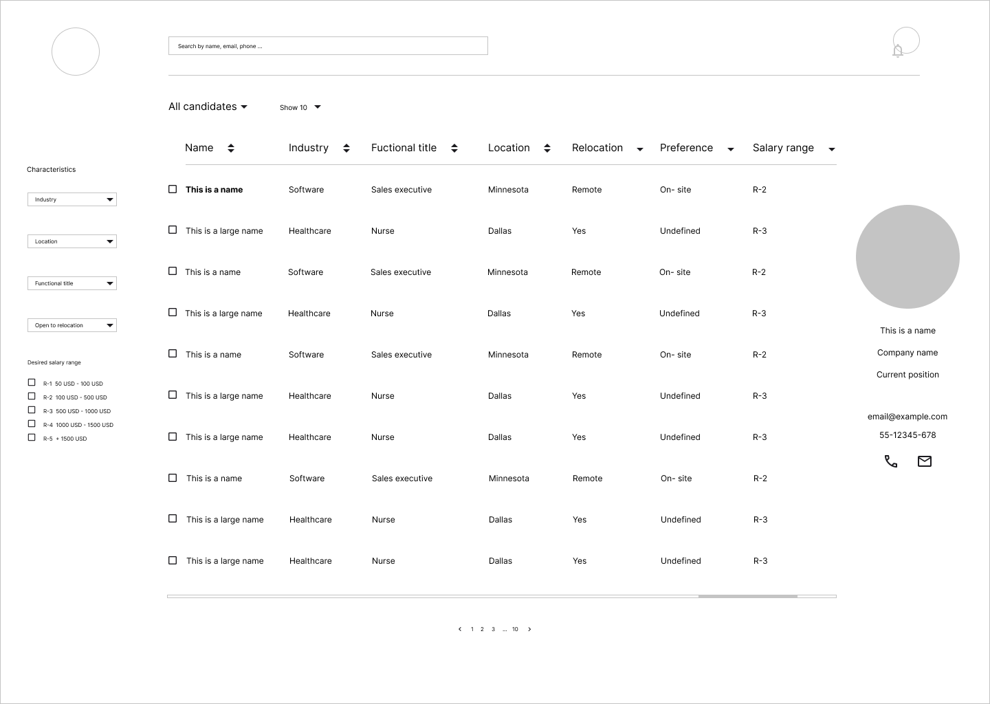
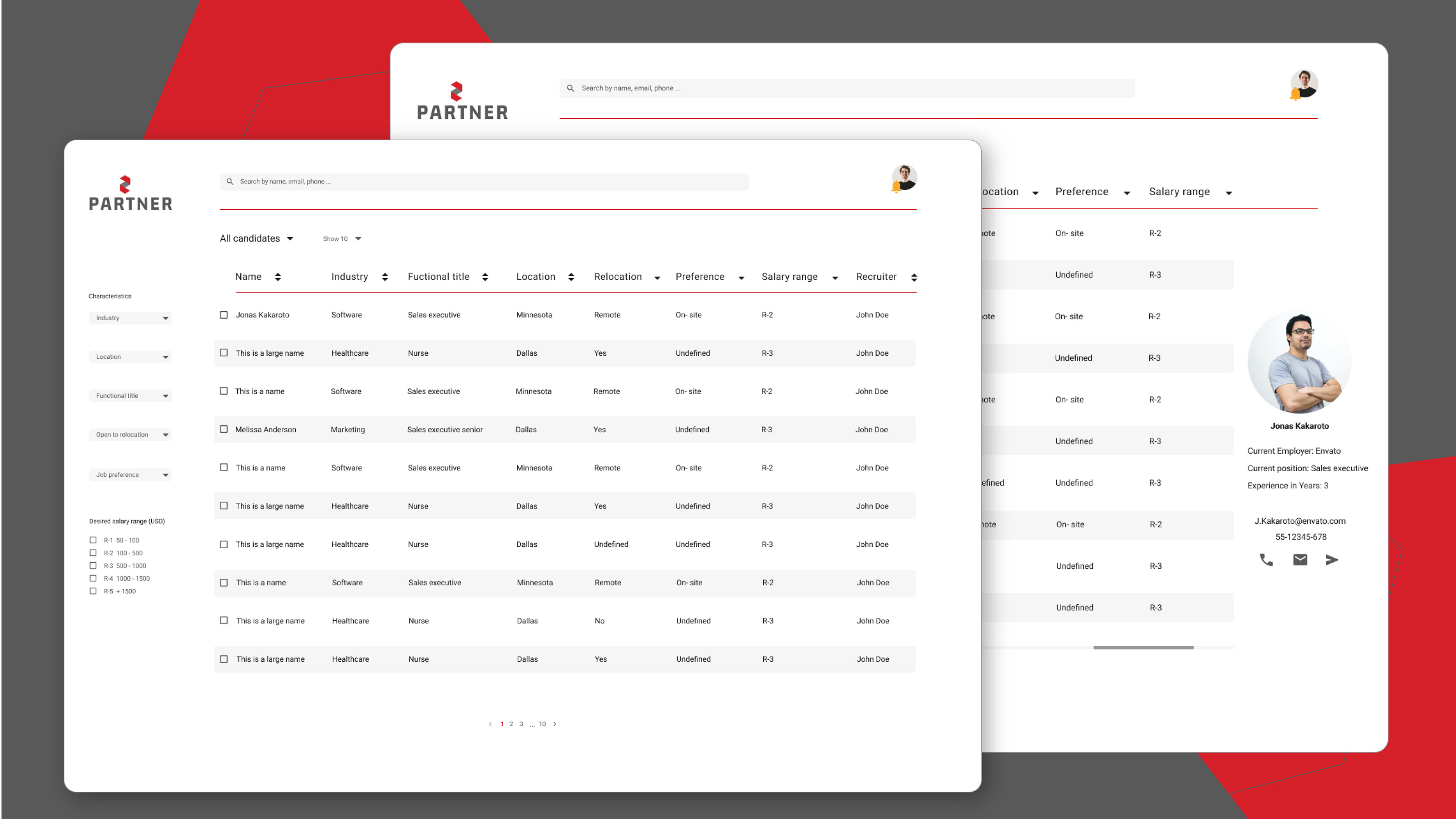
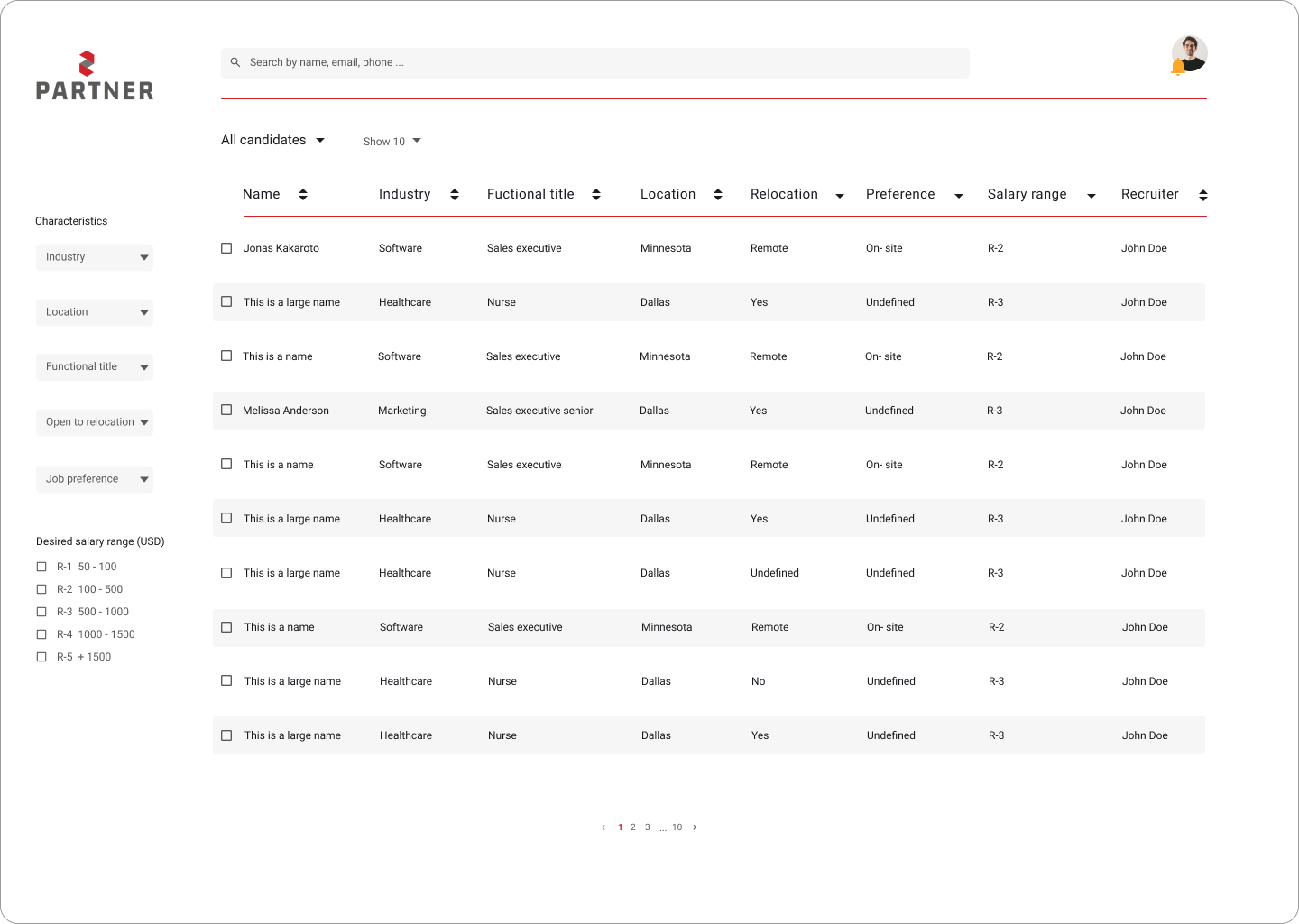
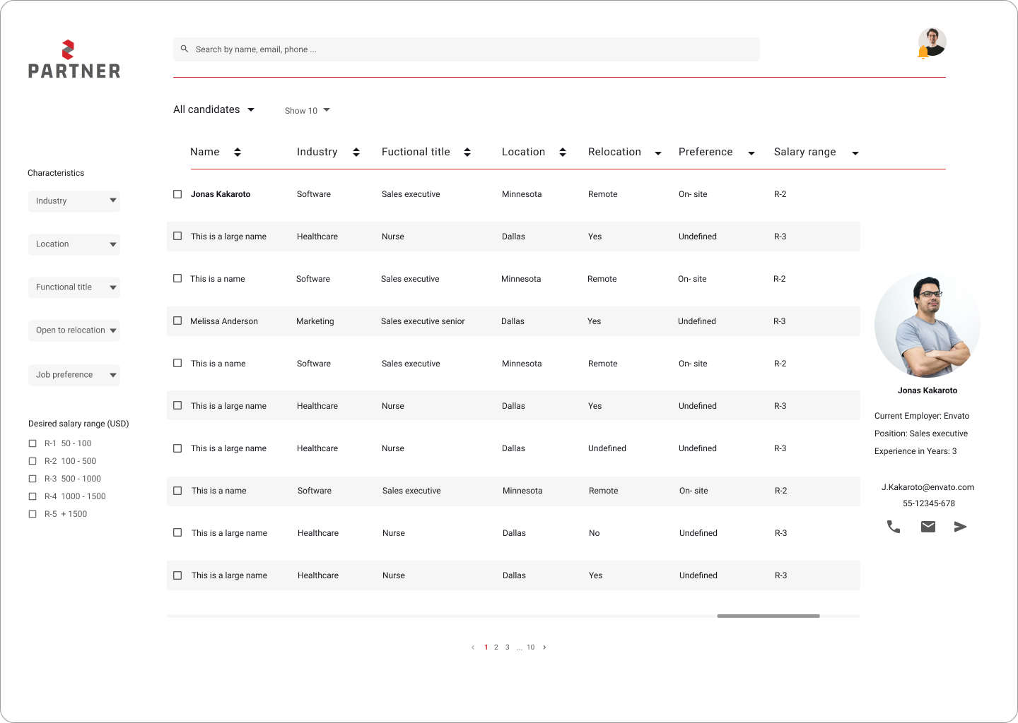
Candidates list
In the new platform design, recruiters can search for candidates by specific information (name, email, phone number) as they had indicated in the interviews. The filter options were reduced leaving the most important and commonly used ones. Salary expectations were grouped into five ranges to make the search easier. In addition, recruiters can now choose whether they want to see only their candidates, all candidates or those of a specific recruiter.
The visual design was based on UI Pattern that most of the users already know from other websites. The search bar is at the top, the filters are on the right side and the main information occupies most of the space.
Info Box
One of the main user pain points was that recruiters want to see candidate information without leaving the list. That is why this function was added to the table. To facilitate that process, the recruiter only has to click on the candidates name.
A window next to the list will open with the candidate data, the candidates picture and the recruiters can contact them directly via phone or email.
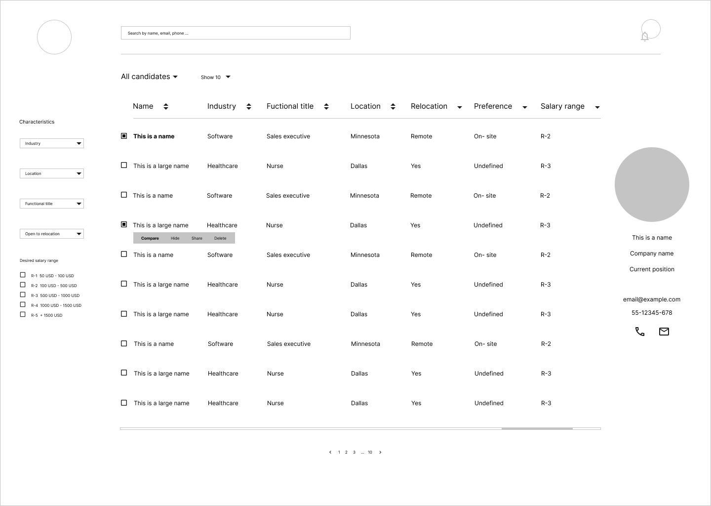
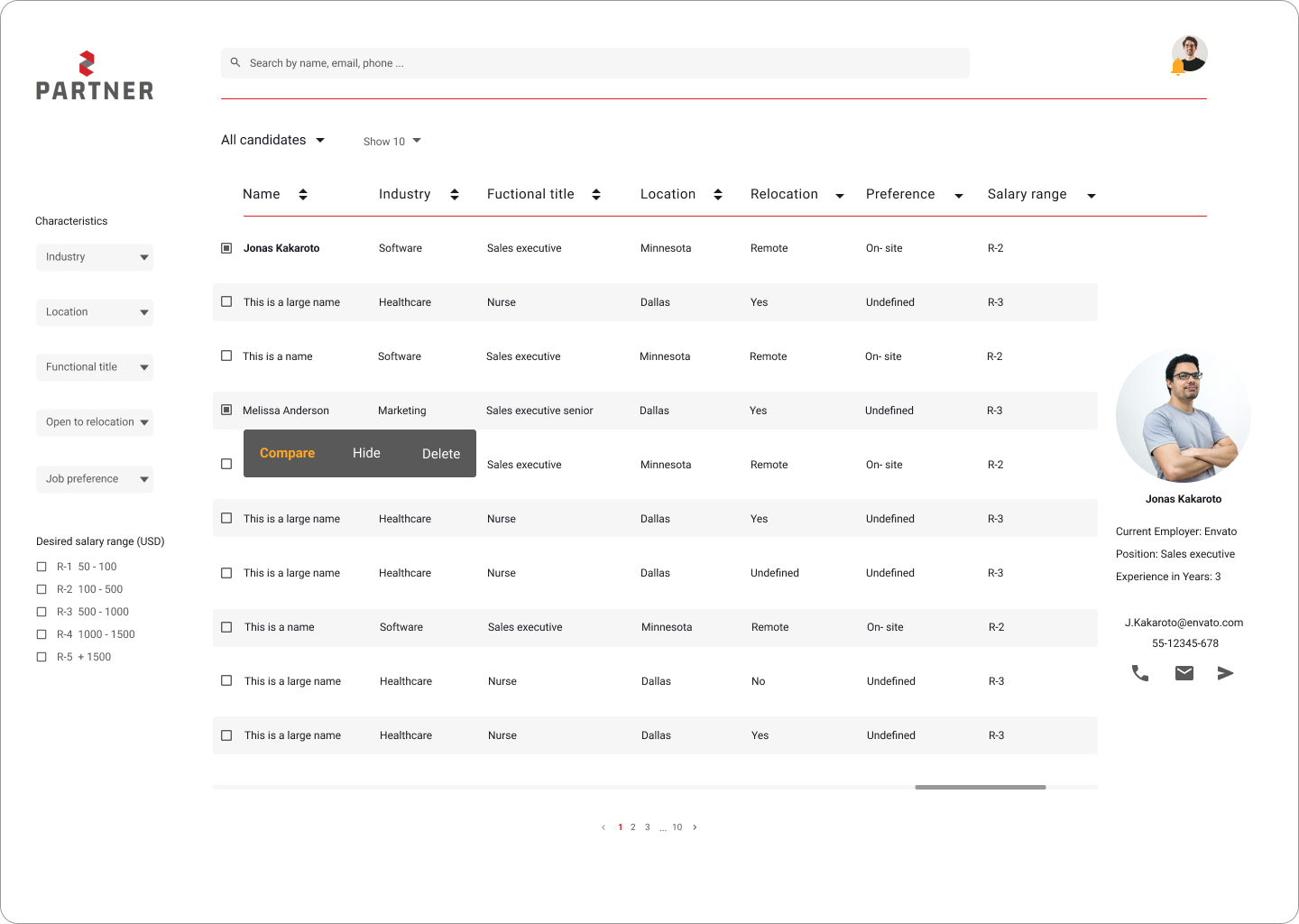
Comparing Candidates
Comparing candidates was also one of the main pain points for users. On the new platform, recruiters can check the checkbox placed next to the candidate's name. Clicking on at least two names will open a menu, which allows the recruiter to select one of three actions, compare, hide or delete candidates.
Recruiters will only be able to eliminate candidates with whom they work directly. If the selected candidates work with other recruiters, they can only be hidden and the delete function will be disabled.
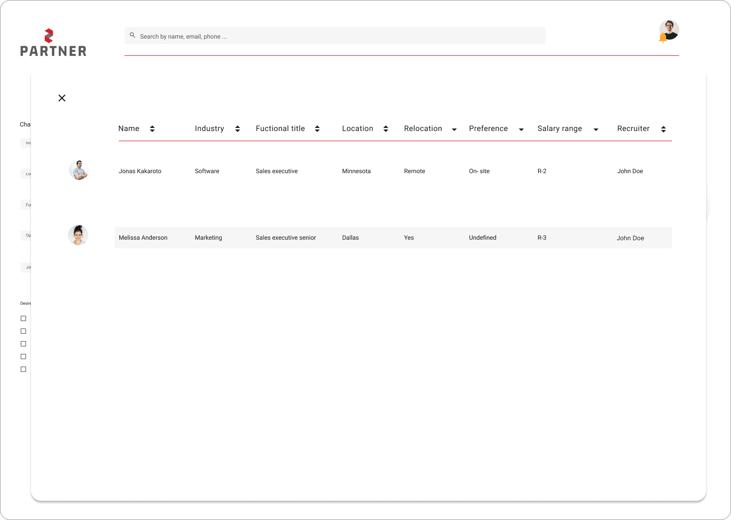
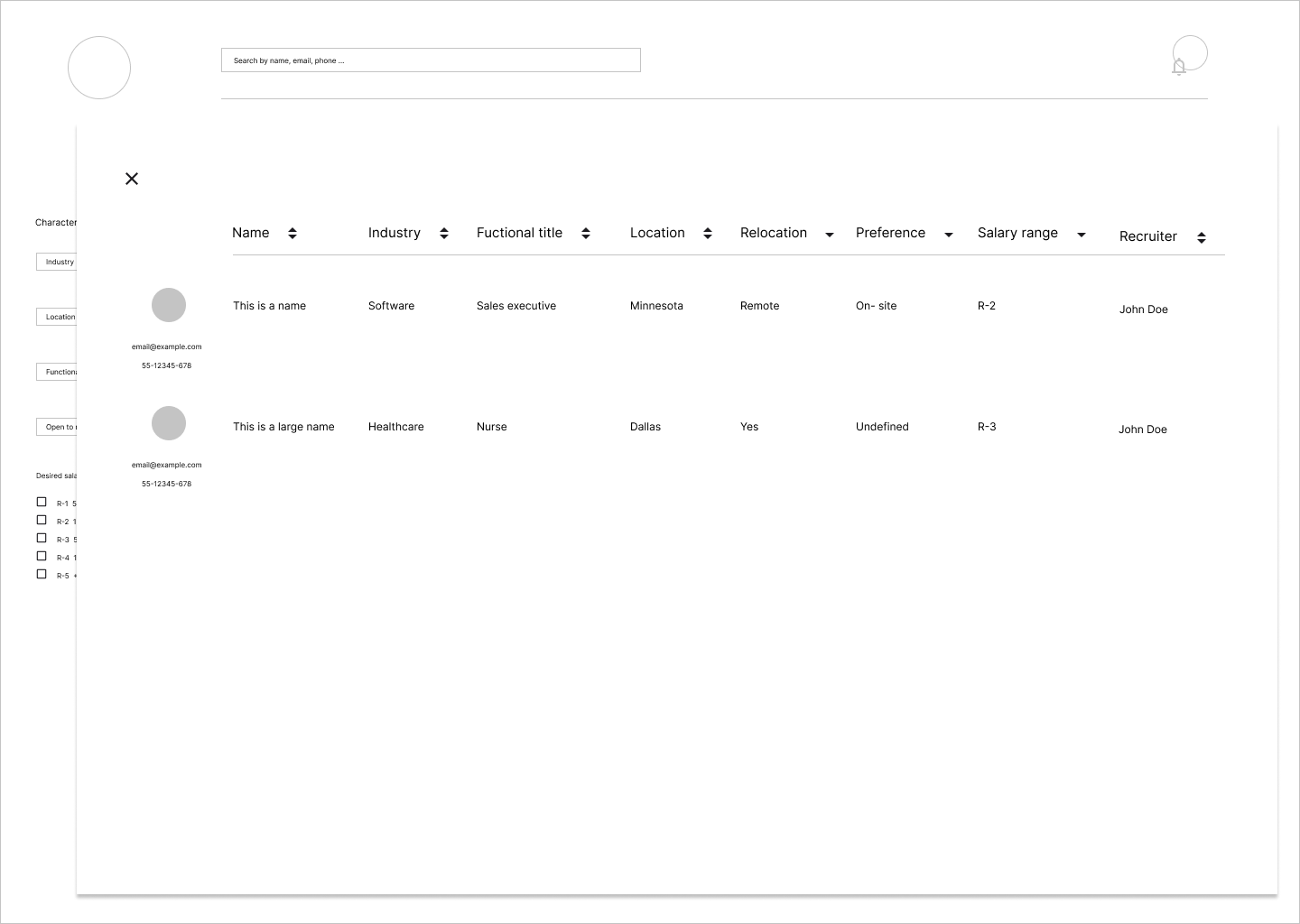
Candidates info
When the function compare will select in the menu, an extra window will open with the selected contacts information and their contact data.
The comparison table is exactly the same as the candidate list to keep the consistency in the visual design. The only exception is that the comparison list also shows the candidate photo profile if it is available. This feature was added because many recruiters remember candidates easier when they see their photo.
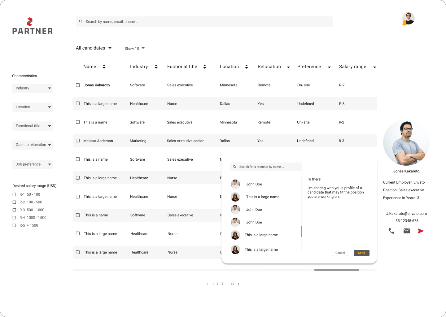
Share candidates with other recruiters
Since most candidates tend to communicate with each other to exchange information about candidates that might be of interest to other recruiters, this feature was added to the new design.
To facilitate this feature, recruiters can search by name for the person(s) with whom they would like to share the candidate. On the left side there is a predefined message and at the bottom two buttons to cancel or complete the task.
User gets feedback
When completing a task it is important that the user receives clear feedback if the action was performed successfully or if a problem occurred. After sharing a candidate a notification will be displayed on the screen to indicate that the action was successful or otherwise, that it could not be completed successfully.

Design System
For this project an small design system was also created so that other designers and programmers can continue to create elements and continue to monitor the project.
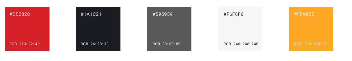
Colors
Typography

UI Elements

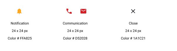
Icons
Source: Material symbols